
Love Letters #2
- Tom!
- Nov 24, 2024
- 5 min read
Updated: Mar 29
Alright, I’ll do it again, twist my rubber arm.
Truly the most difficult part of deciding to do this (outside of putting yourself out there for everyone to see/judge/criticize/ignore) is that there are so many great books coming out that it’s difficult to shrink the selection down to a few. It’s almost entirely issue #1’s this time, which is a really fantastic sign. New series get launched every week, and with so much quality material to find already, we’re just piling winners on top of winners. These ones are all pretty big name players as well, and while there’s definitely some awesome books coming out from lesser known creators, about less popular subjects, it’s also great to see that some of the biggest name creators and franchises are giving us that high quality material, it’s super healthy for the industry. New readers might shy away titles they don’t recognise, in favour one’s they do, so it would be really helpful if a big name like Wonder Woman was starring in a great book right now, speaking of which…
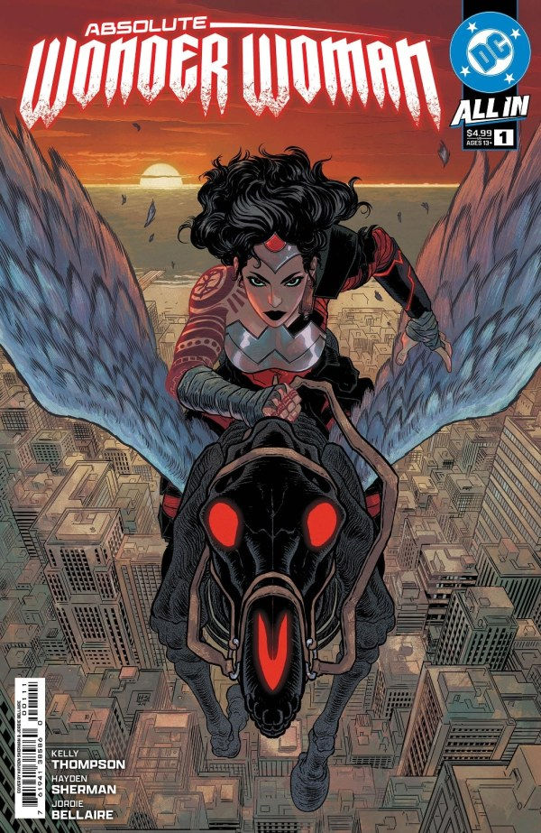
Absolute Wonder Woman #1
Writer: Kelly Thompson Artist: Hayden Sherman Colourist: Jordie Bellaire
Last time I did this, I wrote about how happy Absolute Batman #1 made me while reading it. I felt almost the exact same about Absolute Wonder Woman, but you can replace the charm of the big, dumb fun of Abs Bats, with the excitement of seeing a truly interesting world and mythos get created in front of you. This new Wonder Woman goes heavy on the moody, heavy on the dark and very heavy on the epic. Hayden Sherman is a genius when it comes to page/panel layout and honestly, his layout contributes just as much to the enjoyment of this book as the story and art do. Hats off to the incredible 6 pages where we see Diana growing up from a baby to an adult, all from the same shot of the cave she grows up in as it progressively becomes more and more furnished, decorated and homely. There’s not a lot of dialogue going on there, but it’s full to the brim with top-notch world and character building.
Also, shout out to Absolute Superman #1 which also got released quite recently. Another of these Absolute titles that I’m really looking forward to going on the journey with. Much more dialogue and exposition heavy, but as with the other Absolutes, it brings a really strong and distinct personality with it.
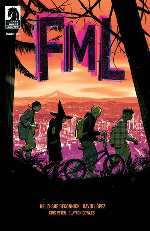
FML #1
Story: Kelly Sue DeConnick Art: David López Colours: Cris Peter
Hell. Yes. I’m going to need more of this, directly into my veins please. It’s funny, it’s gorgeous, it’s relatable, it accomplishes a lot in a relatively short space, and it’s positively dripping with character. I had high hopes in the lead up to FML coming out, and it really smashed my expectations. It sets up a quirky, borderline YA coming of age story with all the formalist boxes ticked. You’ve got great setting, tone and pacing, plus interesting and well defined characters (the main characters mum being an obvious stand out). The last page reveal sets the course for where the story is going to go in future issues, but with the rest of the book being so strong, it would hardly have mattered which direction it was going in, I would have been all in either way. Buy this book pls.
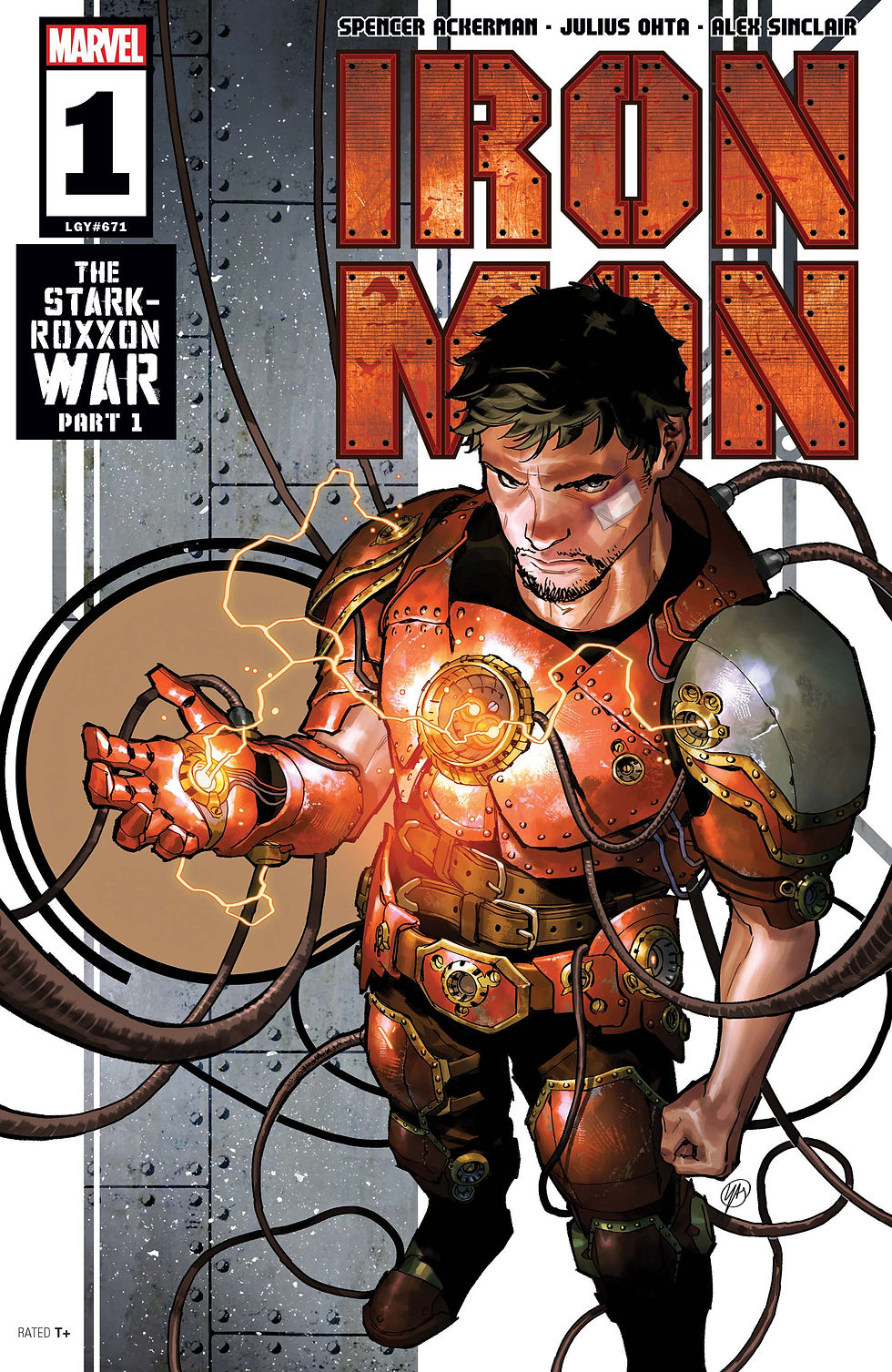
Iron Man #1
Writer: Spencer Ackerman Artist: Julius Ohta Colours: Alex Sinclair
It’s certainly not the most outlandish thing in the world to make a story about billionaire industrialist Tony Stark that hits political allegory notes and puts Iron Man in situations where he can react to the time period he’s being written in. It’s practically the only place he really works. But they gave him to Pulitzer Prize winning national security journalist Spencer Ackerman, and he did the thing, he put him into the political climate we’re living in right now, and after one issue you already feel how much he has to say, and how much he wants to use Tony to get his feelings across. And it worked fantastically. From a grand scheme point of view, it’s playing the classic “Tony loses everything and has to build himself back up” tune, but in it’s nuts and bolts, you can really feel a grand story beginning here, it’s clearly got something to say. The stakes are high, the history is deep and the characterisation of Tony feels spot on. Oh, and Julius Ohta’s art is a great fit too, there are some top panels where the way he uses light and shadows really helps set the tone and scale of the story.
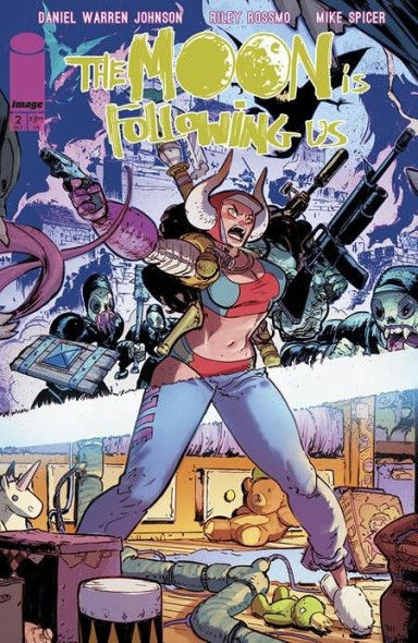
The Moon Is Following Us #2
Writer/Artist: Daniel Warren Johnson
Art: Riley Rossmo Colours: Mike Spicer
Daniel Warren Johnson puts out a new book and you buy it, those are the rules as I understand them. In The Moon is Following Us, he’s sharing the art duties with Riley Rossmo, with each of them handling one aspect of the story, one that takes place in the real world, and one that takes place in a dreamscape. Issue 1 really missed the mark for me, maybe I had hyped it up too far for myself, but my monkey brain felt let down by the story, despite how stunningly gorgeous it is. Issue 2 felt made it all click into place for me, mostly because the bulk of it took place in the real world, giving context to most of what happened in the first issue (I’m wishing they had’ve combined these two into one super-sized first issue, but you know, sales and all that). Now with the full picture in view, I can see the heartfelt story of parenthood, told with an original fantasy twist, and going back to re-read the first issue, I’m loving it. And that stunningly gorgeous art I was talking about? Both of the art styles work wonderfully together, with Rossmo’s pages looking like a more cartoonish, poppy version of DWJ’s, both of them getting so much detail into each panel, it’s a serious feast for the eyes.
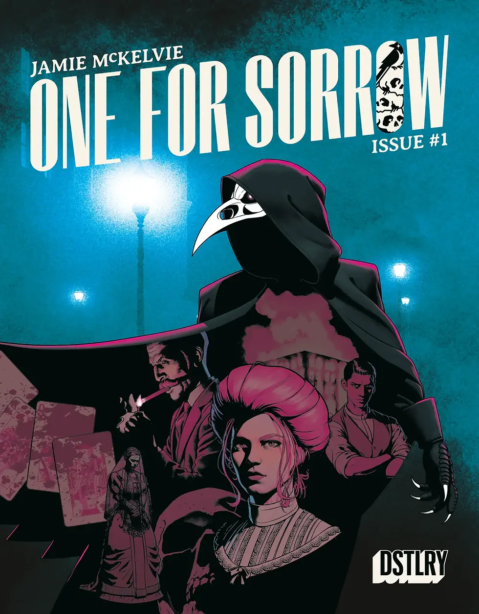
One For Sorrow #1
Story/Art/Colours: Jamie Mckelvie
I’m not normally that into period pieces, and doubly so ones set in Victorian-era England, but I am a big fan of Jamie McKelvie (Wicked and the Divine is an all timer, and the man designs a mean costume) so this one was worth a shot. As it turns out, I very much do like a period piece set in the Victorian era if it’s going to be as well told as this One For Sorrow is. The publisher, DSTLRY, prints double sized issues in magazine size, and this one makes use of every inch. There is so much story in here that I felt like I was watching a movie length premier episode of a TV series. The story is very much Batman: Mask of the Phantasm meets Sherlock Holmes with a sprinkle of the supernatural, and the way it pulls all of it’s seemingly unconnected stories together at the end is applause worthy stuff. So happy to have taken the punt on this one.

Comments